Twenty marks for one pyor.
Icon explorations in Pyor’s own language — the diff, the review, the merge, the dock. One becomes the favicon and the app icon; the rest are here to choose from.

The full suite is built from this mark.
One command retargets every asset to any variant below.
- favicon.ico · 16 · 32 · 48
- icon.svg · vector
- apple-icon.png · 180
- icon-192/512.png · PWA + maskable
- icon.icns · macOS app
- icon.ico · Windows app
- icons/*.png · Linux 16→1024

The canonical mark: the diff “add”.
Ink “+” on a solid green tile: the loudest, most findable mark.

Added over removed: review in one glyph.

The site’s green diff gutter, on paper.

A confident review check.
A dock over water: the name, literally.
Monogram with the diff marker.
An inline note on a line.
Code, framed around a caret.
A branch landing into main.

The “@@” jump, abstracted.
A room of its own.
Added / removed, halved.
Three lines: +, context, −.
A nautical nod to the pyor.

A badge form of the mark.
Ink stem, green bowl.
The line-number rail of a review.
Quiet wordmark seed.
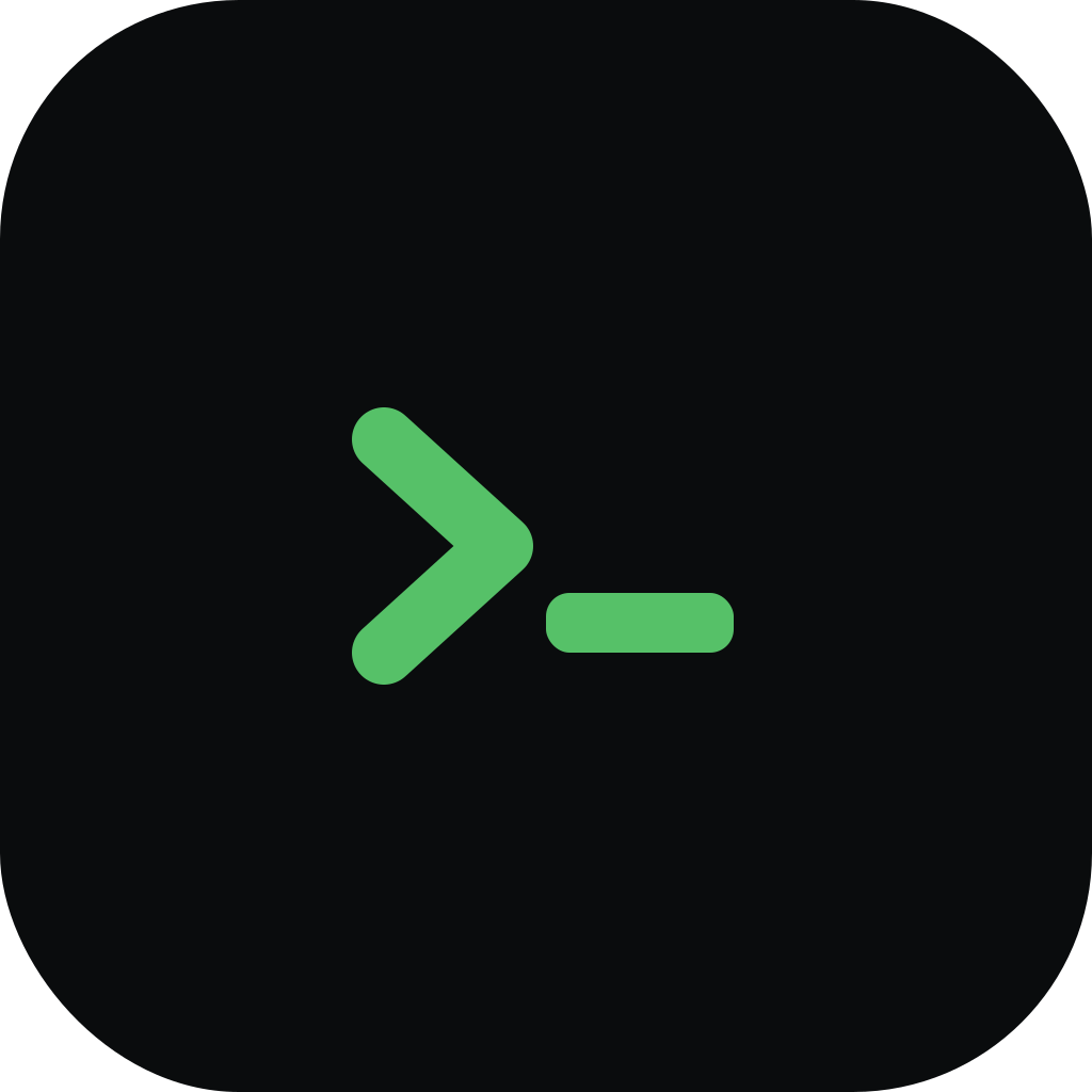
A native, keyboard-first feel.
@@ To make any mark the official one: node scripts/brand/build-suite.mjs <id>: rebuilds the favicon, app icons and PWA set from that variant. @@
Questions about the brand? support@pyor.review